Last edited by SilentShino on Sun May 15, 2011 7:31 pm; edited 1 time in total
Guest Guest
Subject: Re: Comment On The Sig ^ You Sun Jan 09, 2011 8:08 pm
Quote :
Ok I'll Start
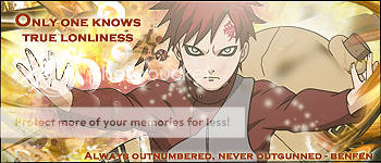
I actually really like that one. It's a big step up from where you started shino. . Though I might reccomend making your sigs a little bit less wide as to get more focus on the render itself. The sunlight effects on the render itself are beautiful along with those rays. However I would have made the border a little less thick and without the design on it as it draws away from the sig itself. Also the text is to big, to unreadable, and to far away from the render. A simple font is your best choice.
Guest Guest
Subject: Re: Comment On The Sig ^ You Sun Jan 09, 2011 8:13 pm
I really like this one lumi it's one of the best I've seen you do and the only thing I'd say is be careful with the text cause it draws attention away from the render and other than that it's pretty perfect.
Guest Guest
Subject: Re: Comment On The Sig ^ You Mon Jan 10, 2011 2:11 pm
It's cute, and well, everyone likes cookies! If you don't...well you can go to hell.
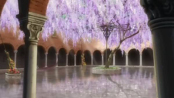
Went back and used anime scenery on my failed SOTW entry.
The background I used, I altered the entire right corner though.
Guest Guest
Subject: Re: Comment On The Sig ^ You Mon Jan 10, 2011 4:13 pm
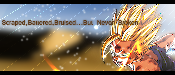
Thats really good spec but the text is a little hard to read and maybe make the smudging a little more noticeable.


 Subject: Comment On The Sig ^ You
  Sat Jan 08, 2011 4:50 pm
 . Though I might reccomend making your sigs a little bit less wide as to get more focus on the render itself. The sunlight effects on the render itself are beautiful along with those rays. However I would have made the border a little less thick and without the design on it as it draws away from the sig itself. Also the text is to big, to unreadable, and to far away from the render. A simple font is your best choice.